

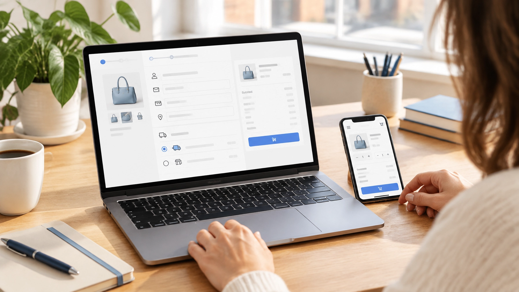
Title tag: Ecommerce Web Design Philadelphia: 10 Ways to Boost Checkouts
Meta description: Ecommerce web design Philadelphia tips to simplify checkout, build buyer confidence, and help local customers complete purchases on any device with ease.
Your checkout should make buying feel simple, clear, and secure. For Philadelphia ecommerce businesses, ecommerce web design that drives more checkouts combines thoughtful layout with practical details, like upfront delivery costs, mobile-friendly forms, and payment options your customers recognize.
Small improvements can remove the hesitation that stops a ready-to-buy shopper. Here are 10 elements to review in your store.
1. DESIGN FOR MOBILE FIRST
Many customers browse and shop from their phones. Make sure the checkout is easy to use on a small screen, with readable text, comfortable tap targets, and buttons that stand out.
Keep the flow focused, too. Customers shouldn’t need to pinch, zoom, or scroll past distractions to enter their details and place an order. Test the full purchase journey on real phones, not just in a desktop browser preview.
2. LET CUSTOMERS CHECK OUT AS GUESTS
Don’t require a new account before someone can buy. Put guest checkout front and center, then offer account creation after the order is complete.
Account sign-up adds a decision and extra steps at a moment when shoppers want to finish. If returning customers can sign in easily, keep that option available without making it the only path. A straightforward choice respects both first-time shoppers and loyal customers.
3. SHOW THE FULL COST EARLY
Unexpected costs can derail an order. Show shipping charges, available delivery choices, taxes, and the running total as early as you reasonably can, ideally in the cart or before customers begin entering payment details.
For a Philadelphia-area store, spell out local pickup or delivery options, including eligibility and timing. Don’t make customers reach the final screen to learn whether an order can arrive when they need it. Clear costs help shoppers make an informed decision and build trust in your store.
4. ASK ONLY FOR THE DETAILS YOU NEED
Every extra form field adds work. Request only the information needed to fulfill the order and process payment. Use clear labels, enable browser autofill, and match the keyboard to the field, for example, a number pad for phone or card details.
Hide optional fields, such as a second address line, until a customer needs them. Let billing details match the shipping address by default, with a simple option to change them. A shorter, well-organized form helps shoppers move forward without second-guessing what to enter.

An ecommerce storefront should make products and shopping paths easy to understand from the start.
5. OFFER FAMILIAR PAYMENT OPTIONS
A customer who reaches checkout is ready to pay, but their preferred method still matters. Offer card payments and relevant digital wallets, such as Apple Pay or Google Pay. Depending on your audience and store, PayPal or a buy-now-pay-later option could also make sense.
Choose payment methods based on your customers and your business needs, rather than adding every option available. Make the choices easy to spot and explain any payment-related steps plainly. A fast, familiar way to pay can remove friction at the final stage.
6. MAKE TRUST EASY TO SEE
Customers need to feel comfortable sharing their information and placing an order. Use a secure checkout, familiar payment-provider indicators, and a clear link to your privacy policy. Make return, refund, and contact details easy to find before purchase.
Be specific and reassuring without crowding the page with badges or promises. A visible support contact and straightforward policies often answer the practical questions shoppers have: “What if it doesn’t fit?” “When will it arrive?” “Who can help?”
7. MAKE ERRORS SIMPLE TO FIX
A payment or address error shouldn’t force customers to start over. Explain what needs attention near the relevant field, say how to correct it, and keep the other information they’ve already entered.
For example, “Enter a valid ZIP code” is more useful than “Something went wrong.” Make messages readable on mobile, too. Clear error handling keeps a small mistake from turning into an abandoned cart.
8. SHOW WHERE CUSTOMERS ARE IN THE PROCESS
A short progress indicator, such as Shipping → Payment → Review, helps shoppers understand what’s next. Use specific button labels like “Continue to payment” rather than vague directions such as “Continue.”
Once checkout begins, reduce distractions. Keep the order information handy, but remove promotional pop-ups, unrelated menus, and interruptions that pull attention away from the purchase. The goal isn’t to rush customers; it’s to make the next step obvious.
9. KEEP THE ORDER SUMMARY ACCURATE AND EDITABLE
Before customers pay, show what they’re buying: product name, image, selected size or color, quantity, price, and any discounts. Make it easy to change a quantity or correct a selection without losing checkout progress.
For local orders, repeat the chosen delivery or pickup method and estimated timing in the review step. This final check helps customers spot a mistake before purchase, and helps prevent confusion after the order is placed.
Vanessa Collado’s eFilters ecommerce project shows how a clean storefront can organize products and shopping paths around the customer’s needs.

10. KEEP CHECKOUT FAST, THEN TEST IT
Checkout speed matters most when a customer is ready to pay. Optimize large images, avoid unnecessary scripts, and check how the payment flow performs on mobile connections. Test the full journey regularly, including product selection, delivery choices, payment, and confirmation.
Then review your own store data. Where do customers leave? Are payment errors concentrated on mobile? Do shoppers abandon after seeing delivery costs? Use those patterns to choose what to improve next, and compare results after each change. Cart reminders can also bring shoppers back, use permission-based messaging and link directly to their saved cart where possible.
For more practical performance tips, read 5 Steps to a Faster Website That Turns Visitors into Customers. Regular checks help catch technical issues before they disrupt sales; see 7 Website Maintenance Mistakes Every Philly Business Makes (and How to Fix Them).
TURN MORE SHOPPING SESSIONS INTO COMPLETED ORDERS
A better checkout isn’t about adding more features. It’s about removing uncertainty and helping customers complete the purchase they came to make, from the first tap to the order confirmation.
Vanessa Collado builds personalized websites for Philadelphia businesses, with ecommerce setup available through web design packages. If your store needs a clearer checkout, an updated design, or ongoing support, contact Vanessa Collado to discuss your goals.